Written by Liting 2022 Cohort
I think the psychology of learning can be regarded as a practical approach to UX design. Why? Because the purpose of user experience is to make the product feel comfortable and easy to use so that we, users, can accept and be satisfied with it. The purpose of using psychology is also to improve people’s universal pursuit of happiness. So, in light of this, I will discuss how psychological theories are applied to user experience design.
The Peak End Rule & User Journey Maps
The famous psychologist Daniel Kahneman once proposed the peak-end rule. Our experience memory is determined by two factors, the peak and the feeling at the end; whether it is good or not, the moment we feel the deepest will characterize our impression of the experience. If we co-relate this theory to UX, we will find that many product designs have applied it. For example, although, we have many unpleasant experiences when shopping at IKEA, such as: buying only one piece of furniture; needing to walk through the entire mall; there being too few clerks; we have to find the goods on the shelves and move them down, etc; our “peak-to-end experience” was good. For customers, the peak is a value-for-money product, a practical and efficient display area, a free trial experience, and convenient and cheap food. And what is the end? It might be the 1 dollar ice cream at the exit.

The Hick Rule & Option design
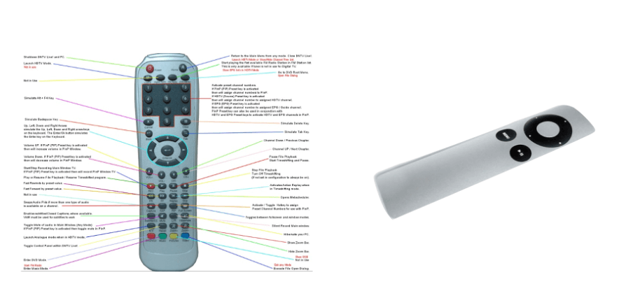
The Hick Rule mainly describes that as the number of options increases, the time invested gains logarithmically. In short, the fewer options, the faster the operation time.

In UX design, it means the more choices a user has to make, the longer it takes to learn and make decisions. So how was this theory applied to interaction design? For example, when a step is wrong, and an error or an alarm is issued, the user needs to make a quick decision in a short time and when being pressed for time. In this case, “selection paralysis” usually occurs when there are multiple options that are not prioritized, which leads to wrong user choices again- first, emotional frustration, and then a more difficult experience. Eventually, it goes wrong again. On the contrary, if the options are simple and clear, the experience will be more comfortable and controllable. Which theory is more to your liking?